Today I had my exit seminar, which is equivalent to the PhD defense since at Berkeley, we don't have a defense like other places. I am one step forward to Dr. Kong now ^)^
It started with my advisor Richard to give an introduction of me, and I really enjoyed working with Richard in the last 7 years, I learned so much from him! Then my friend Kathryn and Felipe prepared a hilarious presentation to toast me, it showed my fun facts in the last 7 years. I then summarized my work at Berkeley into a 40 min talk, it is all about MyShake, the project I worked on during my PhD life here at Berkeley. 7 years work, when I looked back, I really accomplished a lot!
I am really glad that my whole family came to my seminar, even though my parents are not English speakers, they always support me without any asking for returns! I am also really happy that my good colleague and friend Roman from DT also joined me to celebrate my graduation!
I feel really lucky that I could come to Berkeley for a PhD, it is a life change event, that will change my life forever. I really appreciate all the people who helped me here and accompany me during the 7 years. How valuable it is for this great opportunity here.
Now, I am really excited about the new life after my graduation (technically, I still need to submit my dissertation and get signatures from my committee members to graduate). At the same time, I am a little sad about finishing my PhD, it marks a milestone for me! I am so used to my role as a PhD student ^_^ I think there are a lot of interesting things to do in the future, just follow your heart and have fun in the work!
Thursday, April 19, 2018
Sunday, April 15, 2018
Python: Jenks Natural Breaks
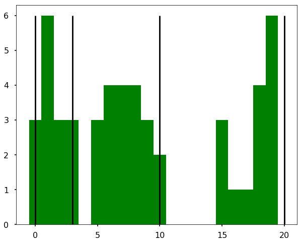
This week we will talk about the Jenks Natural Breaks, it is mostly useful for determining the map ranges. It finds the best way to split the data into ranges, for example, if we have 50 countries, 15 countries with 0 - 3 values, 20 countries with values from 5 - 10, and 15 countries with 15 - 20. Therefore, if we want to plot them on a map with different colors, the best way we are splitting the data is 0-3, 3-10, and 10-20. The Jenks Natural Breaks is an algorithm that will figure this out by grouping the similar values into a group. Let’s see the example below. I am using an existing package - jenkspy, to calculate the breaks. You can find the notebook on Qingkai’s Github.
import jenkspy
import numpy as np
import matplotlib.pyplot as plt
plt.style.use('seaborn-poster')

%matplotlib inline
# Let's generate this 3 classes data
data = np.concatenate([np.random.randint(0, 4, 15), \
  np.random.randint(5, 11, 20), np.random.randint(15, 21, 15)])
# Let's calculate the breaks
breaks = jenkspy.jenks_breaks(data, nb_class=3)
breaks
[0.0, 3.0, 10.0, 20.0]
plt.figure(figsize = (10,8))
hist = plt.hist(data, bins=20, align='left', color='g')
for b in breaks:
    plt.vlines(b, ymin=0, ymax = max(hist[0]))

We could see the above figure that the breaks (black lines) are exactly what we expect!
How it works?
The method is an iterative process to repeatedly test different breaks in the dataset to determine which set of breaks has the smallest in-class variance. You can see the above figure that within each group/class, the variance is smallest. But note that if only minimize the in-class variance, if we maximize the out-class variance (that is variance between different groups), the breaks will fall into the middle of the gaps above figure (in this case, it will be 4.5, 12.5, but I didn’t try).
Another example
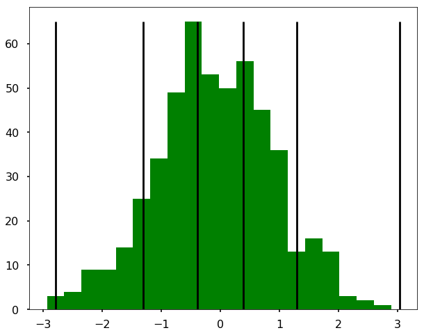
Let’s have fun and see what the breaks for a normal distribution. (I didn’t find the connection to 3 sigmas as I thought!).
np.random.seed(1)
normal = np.random.normal(loc=0.0, scale=1.0, size=500)
breaks = jenkspy.jenks_breaks(normal, nb_class=5)
breaks
[-2.79308500014654,
 -1.3057269225577375,
 -0.39675352685597737,
 0.386539145133091,
 1.2932258825322618,
 3.0308571123720305]
plt.figure(figsize = (10,8))
hist = plt.hist(normal, bins=20, align='left', color='g')
for b in breaks:
    plt.vlines(b, ymin=0, ymax = max(hist[0]))

References
Monday, April 9, 2018
Pandas groupby example
Pandas groupby function is really useful and powerful in many ways. This week, I am going to show some examples of using this groupby functions that I usually use in my analysis.
import pandas as pd
import matplotlib.pyplot as plt
import numpy as np
plt.style.use('seaborn-poster')

%matplotlib inline
Let's first create a DataFrame, that contains the name, score and round for some games.
a = ['Qingkai', 'Ironman', 'Batman', 'Qingkai', 'Ironman', 'Qingkai', 'Batman']
b = [3., 4, 2., 4, 5, 1, 2]
c = range(len(a))

d = [[x,y,z] for x,y,z in zip(a,b,c)]

df = pd.DataFrame(d, columns=['name', 'score', 'round'])
df
Now I want to calculate the mean scores for different users across all the games and the standard deviations. It could be quite simple with Pandas. As I am showing below:
df.groupby('name').mean()| score | round | |
|---|---|---|
| name | ||
| Batman | 2.000000 | 4.000000 |
| Ironman | 4.500000 | 2.500000 |
| Qingkai | 2.666667 | 2.666667 |
df.groupby('name').std()| score | round | |
|---|---|---|
| name | ||
| Batman | 0.000000 | 2.828427 |
| Ironman | 0.707107 | 2.121320 |
| Qingkai | 1.527525 | 2.516611 |
Or I can loop through the groupby object once to calculate them all.
for ix, grp in df.groupby('name'):
    print('Name: %s, mean: %.1f, std: %.1f'%(ix, grp['score'].mean(), grp['score'].std()))
Name: Batman, mean: 2.0, std: 0.0
Name: Ironman, mean: 4.5, std: 0.7
Name: Qingkai, mean: 2.7, std: 1.5
But also, we could do it with one liner using the agg function:
df.groupby('name').agg({'score':['mean','std'],'round':'count'})| score | round | ||
|---|---|---|---|
| mean | std | count | |
| name | |||
| Batman | 2.000000 | 0.000000 | 2 |
| Ironman | 4.500000 | 0.707107 | 2 |
| Qingkai | 2.666667 | 1.527525 | 3 |
Besides, you can also use some customized functions in the agg as well. For example, if we want to calculate the RMS value of the score, we could do the following:
def cal_RMS(x):
return np.sqrt(sum(x**2/len(x)))df.groupby('name').agg({'score':['mean',cal_RMS],'round':'count'})| score | round | ||
|---|---|---|---|
| mean | cal_RMS | count | |
| name | |||
| Batman | 2.000000 | 2.000000 | 2 |
| Ironman | 4.500000 | 4.527693 | 2 |
| Qingkai | 2.666667 | 2.943920 | 3 |
Subscribe to:
Posts (Atom)
