When we are dealing with machine learning datasets, many times, we have higher dimensional data than just the easy 2 dimensions. This makes us difficult to visualize the data to get a sense how different dimensions have a relationship with each other, or is there a hidden structure inside it. Today, I will show you the ways I usually use to visualize the higher dimensional datasets. You can find all the script at Qingkai's Github.
I summarize ways to visualize high dimensional data into 2 groups:
- Using algorithms to reduce dimension
- Clever way to plot
Let's first see how to use algorithms to visualize the data. In this blog, we will use the IRIS dataset to show how different methods work.
Let's first load data
from sklearn import datasets# import the IRIS data
iris = datasets.load_iris()
iris_data = iris.data
Y = iris.target
print('There are %d features'%(iris_data.shape[1]))
print('There are %d classes'%(len(set(Y))))There are 4 features
There are 3 classes1 Reduce dimension using algorithms
1.1 Visualize high dimensional data with PCA
Principal Component Analysis is the classical way to reduce the dimensions. In our case, we have 4 features, which means we have 4 dimensions, difficult to visualize. With PCA, we can plot the first two components, and get a sense of the patterns hidden behind the data.
from sklearn.decomposition import PCA
import matplotlib.pyplot as plt
%matplotlib inline

plt.style.use('seaborn-poster')
# Let's do a simple PCA and plot the first two components
pca = PCA(n_components=2)
X_pca = pca.fit_transform(iris_data)
# plot the first two components
plt.figure(figsize = (10, 8))
plt.scatter(X_pca[:, 0], X_pca[:,1], c = Y, s = 80, linewidths=0)
plt.xlabel('First component')
plt.ylabel('Second component')<matplotlib.text.Text at 0x111681e10>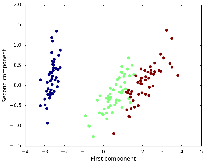
The above figure is showing the first two components of the PCA. I colored the dots with the 3 classes so that we can see the hidden structures.
1.2 Visualize high dimensional data with t-SNE
t-distributed stochastic neighbor embedding (t-SNE) is a nonlinear dimensionality reduction technique that is particularly well-suited for embedding high-dimensional data into a space of two or three dimensions, which can then be visualized in a scatter plot.
from sklearn.manifold import TSNEX_tsne = TSNE(learning_rate=100).fit_transform(iris_data)# plot the first two components
plt.figure(figsize = (10, 8))
plt.scatter(X_tsne[:, 0], X_tsne[:,1], c = Y, s = 80, linewidths=0)
plt.xlabel('First dimension')
plt.ylabel('Second dimension')<matplotlib.text.Text at 0x111a993d0>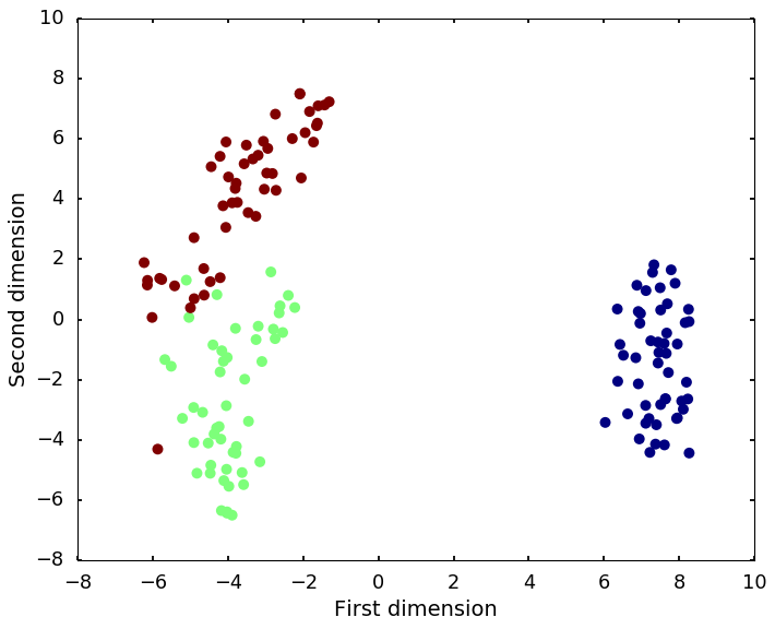
2 Clever way to plot
Also, there are many clever ways to plot the data so that we can get a sense of the data. Pandas is the package I usually use for visualize high dimensional data. Here are some examples from pandas visualization:
import pandas as pd
import numpy as np
# let's first put the data into a dataframe
df = pd.DataFrame(data= np.c_[iris['data'], iris['target']],
columns= [x[:-5] for x in iris['feature_names']] + ['target'])
df.head()| sepal length | sepal width | petal length | petal width | target | |
|---|---|---|---|---|---|
| 0 | 5.1 | 3.5 | 1.4 | 0.2 | 0.0 |
| 1 | 4.9 | 3.0 | 1.4 | 0.2 | 0.0 |
| 2 | 4.7 | 3.2 | 1.3 | 0.2 | 0.0 |
| 3 | 4.6 | 3.1 | 1.5 | 0.2 | 0.0 |
| 4 | 5.0 | 3.6 | 1.4 | 0.2 | 0.0 |
2.1 Scatter plot matrices
We know that scatter plot is a great tool to visualize the relationship between two variables, if we put every two variable pairs into a scatter plot and make them into a nice matrix, it is the scatter plot matrices. From these plots, we can easily see if a pair of variables related to each other.
from pandas.plotting import scatter_matrixscatter_matrix(df[df.columns[[0, 1, 2, 3]]], diagonal = 'density')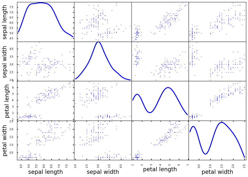
2.2 Parallel Coordinates
Parallel coordinates are a common way of visualizing high-dimensional geometry and analyzing multivariate data. It allows one to see clusters in data and to estimate other statistics visually. Using parallel coordinates points are represented as connected line segments. Each vertical line represents one attribute. One set of connected line segments represents one data point. Points that tend to cluster will appear closer together.
from pandas.plotting import parallel_coordinatesparallel_coordinates(df, 'target')<matplotlib.axes._subplots.AxesSubplot at 0x128946590>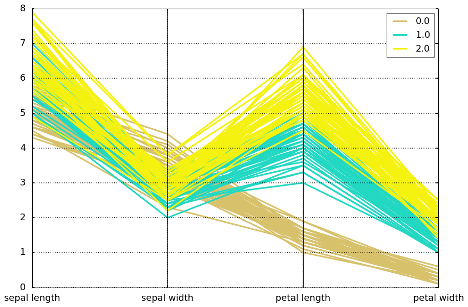
2.3 Andrews Curve
Andrews curves is another way to visualize structure in high-dimensional data. It is basically a smoothed version of parallel coordinates.
from pandas.plotting import andrews_curvesandrews_curves(df, 'target')<matplotlib.axes._subplots.AxesSubplot at 0x129006ad0>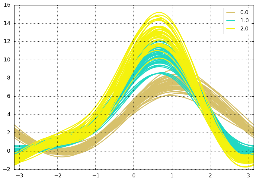
2.4 Radviz
Radviz is another way of visualizing multi-variate data. It is based on a simple spring tension minimization algorithm. Basically you set up a bunch of points on a plane. In our case they are equally spaced on a unit circle. Each point represents a single attribute. You then pretend that each sample in the data set is attached to each of these points by a spring, the stiffness of which is proportional to the numerical value of that attribute (they are normalized to unit interval). The point in the plane, where our sample settles to (where the forces acting on our sample are at an equilibrium) is where a dot representing our sample will be drawn. Depending on which class that sample belongs it will be colored differently.
from pandas.plotting import radvizradviz(df, 'target')<matplotlib.axes._subplots.AxesSubplot at 0x12890f5d0>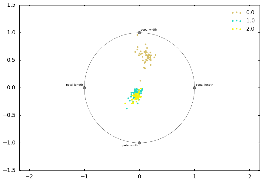
These are usually my ways to visualize the high dimensional data to get a quick sense before I build further models. If you have better ways, please let me know.
The information which you have provided is very good. It is very useful who is looking for machine learning online training
ReplyDeleteDR EMU WHO HELP PEOPLE IN ANY TYPE OF LOTTERY NUMBERS
DeleteIt is a very hard situation when playing the lottery and never won, or keep winning low fund not up to 100 bucks, i have been a victim of such a tough life, the biggest fund i have ever won was 100 bucks, and i have been playing lottery for almost 12 years now, things suddenly change the moment i came across a secret online, a testimony of a spell caster called dr emu, who help people in any type of lottery numbers, i was not easily convinced, but i decided to give try, now i am a proud lottery winner with the help of dr emu, i won $1,000.0000.00 and i am making this known to every one out there who have been trying all day to win the lottery, believe me this is the only way to win the lottery.
Dr Emu can also help you fix this issues
(1)Ex back.
(2)Herbal cure & Spiritual healing.
(3)You want to be promoted in your office.
(4)Pregnancy spell.
(5)Win a court case.
Contact him on email Emutemple@gmail.com
What's app +2347012841542
Website Https://emutemple.wordpress.com/
Https://web.facebook.com/Emu-Temple-104891335203341
Five weeks ago my boyfriend broke up with me. It all started when i went to summer camp i was trying to contact him but it was not going through. So when I came back from camp I saw him with a young lady kissing in his bed room, I was frustrated and it gave me a sleepless night. I thought he will come back to apologies but he didn't come for almost three week i was really hurt but i thank Dr.Azuka for all he did i met Dr.Azuka during my search at the internet i decided to contact him on his email dr.azukasolutionhome@gmail.com he brought my boyfriend back to me just within 48 hours i am really happy. What’s app contact : +44 7520 636249
ReplyDelete