Sunday, September 25, 2016

Using datashader to visualize billions of data points

Visualization is the best way to explore and communicate insights about data. But many times, we find it is difficult to visualize if we have a lot of data points, the traditional visualization techniques break down. datashader is a tool developed by Continuum Analytics come to rescue. It is extremly easy and fast to use it to plot even billions of data points (see the examples or a video from Scipy 2016). 
This week, we will use datashader to plot the global seismicity for earthquakes larger than M2.0. To speed up the process, I downloaded the earthquake locations/times from the ANSS Catalog from 1898 to 2016, and save them as a csv file in the data folder (You can also grab the data directly using the APIs from my previous blog post). All together, we only have 1120244 earthquakes
And with a couple of lines, you can see we get a very nice looking map with the global seismicity. You can find the script and data at Qingkai's Github.
import pandas as pd
import datashader as ds
import datashader.transfer_functions as tf
from functools import partial
from datashader.utils import export_image
from datashader.colors import colormap_select, Greys9, Hot, viridis, inferno
# read in the earthquake data from file, note that I only read
# in 5 columns with Origin time, Latitude, Longitude, Depth, and
# Magnitude of the earthquakes
df_eq = pd.read_csv('./data/catalog.csv', usecols=[0,1,2,3,4])
# now let's plot them using a black background
background = "black"
export = partial(export_image, background = background)
cm = partial(colormap_select, reverse=(background!="black"))

cvs = ds.Canvas(plot_width=1600, plot_height=1000)
agg = cvs.points(df_eq, 'Longitude', 'Latitude')
export(tf.interpolate(agg, cmap = cm(Hot,0.2), how='eq_hist'),"global_seismicity")

Saturday, September 10, 2016

20 Data science questions - Part 2


Continue from last week's first 10 data science questions (part 1), here are the rest of the 10 questions:

Q11: What is selection bias, why is it important and how can you avoid it?
From Wikipedia, selection bias is the selection of individuals, groups or data for analysis in such a way that proper randomization is not achieved, thereby ensuring that the sample obtained is not representative of the population intended to be analyzed. There is a very interesting example on youtube
Selection bias can cause the researcher to reach wrong conclusion. I think the best way to avoid the selection bias is first to get to know the common bias and how it affects research. Here is a nice review of bias on evidence-based medicine. Though slightly different, a lot of the topics/concepts can be applied to other fields. as well. 
Q12: Give an example of how you would use experimental design to answer a question about user behavior.
I don't know how to answer this question, but will try based on my knowledge. To design an experiment to learn user behavior, I think it depends on the problem in hand. We need first understand the goal of the problem, i.e., what behavior we want to understand? And then find the factors that will affect the behavior. We then need brainstorm how to test these factors using experimental method. 

Q13: What is the difference between long and wide format data?
The long and wide format data are used to describe two different presentations for tabular data. In the long format, it is kind of like the key-value pairs to store the data, each subject (Iron man or Spider man) will have data in multiple rows. The wide format data, each subject will have all the variables in the same row but separated in different columns. It is easier to see in an example: 
long format
NameVariableValue
Iron manColorred
Iron manMaterialiron
Iron manPowernuclear
Iron manHeight5'8"
Spider manColorred
Spider manMaterialcloth
Spider manPowerfood
Spider manHeight5'10"
wide format
NameColorMaterialPowerHeight
Iron manredironnuclear5'8"
Spider manredclothfood5'10"
The wide format data usually will have problems when you want to visualize it with many variables. But it is very easy to convert between these two types data using python or R. 
Q14: What method do you use to determine whether the statistics published in an article (e.g. newspaper) are either wrong or presented to support the author's point of view, rather than correct, comprehensive factual information on a specific subject?
I think all the statistics used in newspaper or TV is to support the author's point. This is illustrated in the book How to lie with Statistics
It is difficult to tell whether the statistics is wrong, since we need reproduce the results if we are facing the question and want to solve it by ourselves. But many times, we can not re-do the work, so I don't have a better way to determine if the statistics are wrong. 
Q15: Explain Edward Tufte's concept of chart junk.
If you don't know Edward Tufte, then you should really get to know him and his famous books (see his webpage). I own 4 of his books - The Visual Display of Quantitative InformationEnvisioning InformationVisual Explanations: Images and Quantities, Evidence and Narrative, and Beautiful Evidence. All of these books are great. His most classic book is 'The Visual Display of Quantitative Information', which will make your data visualization goes up to a new level. This chart junk is from this book:
The interior decoration of graphics generates a lot of ink that does not tell the viewer anything new. The purpose of decoration varies — to make the graphic appear more scientific and precise, to enliven the display, to give the designer an opportunity to exercise artistic skills. Regardless of its cause, it is all non-data-ink or redundant data-ink, and it is often chartjunk. 
What he means is the elements in the charts are unnecessary to convey the main information, or distract the viewer. See the following example from WiKi:
image
Q16: How would you screen for outliers and what should you do if you find one?
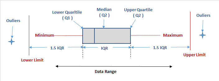
An outlier is an observation that is distant from the other observations. It may from two cases, (1) measurement error or (2) heavy tailed distribution. In the first case, we want to discard the outlier, but in the later case, it is part of the information that need special attention to. 
The way I usually to find an outlier is using the box plot, and if the data point is outside of the 1.5*IQR, I will treat it as an outlier. See more details here.
image
There are more discussions whether to drop the outliers here
Q17: How would you use either the extreme value theory, Monte Carlo simulations or mathematical statistics (or anything else) to correctly estimate the chance of a very rare event?
I don't know the extreme value theory, so will talk using the Monte Carlo simulations to estimate the chance of a very rare event. 
A very rare event is an event occurring with a very small probability. So if you use Monte Carlo directly, it will be really inefficient for sampling the rare events. For example, if the instance occur at the probability 10-9, then on average, we need a sample of size n = 109 to observe just a single occurrence of the event, and much more if we expect a reliable estimation of the mean and variance to obtain a sufficiently narrow confidence interval. 
Importance sampling (IS) is a powerful tool to reduce the variance of an estimator, that is increasing the occurrence of the rare event. The basic idea of importance sampling is to change the probability laws of the system under study to sample more frequently the events that are more important for the simulation. Of course, using this new distribution results in a biased estimator if no correction is applied. Therefore the simulation output needs to be translated in terms of the original measure, which is done by multiply a so-called likelihood ratio. See the details in chapter 2 of Rare Event Simulation using Monte Carlo Methods by Gerardo Rubino and Bruno Tuffin. 
Q18: What is a recommendation engine? How does it work?
A recommendation engine is a system that can predict a user's rating or preference based on the user's activities or other users' activities. One easy example is Amazon, when you browse the books, you always see 'Recommend books for you', and 'Other people may like this'. This is Amazon recommendation engine based on your browse history and other people's browse history. 
There are two common approaches: Collaborative filtering and Content-based filtering
Collaborative filtering
This approach is based on collecting and analyzing a large amount of information on users' behaviors, activities or preferences and predicting what users will like based on their similarity to other users (from WiKi). So the assumption here is that similar people tend to have similar behavior, if we know their past behaviors, we can predict their future behavior. For example, I love machine learning, always browse interesting machine learning books online. Another person also loves machine learning, and he has another set of books he usually browse. So if the system recommend a book I love from me about machine learning to this person, there's a high chance this person will love it as well. 
Therefore, in order to use this approach, the first thing we should do is to collect a lot of data from different users, and use them as the basis to predict future user behavior. The advantage of this method is that, we even don't need know the content of the product, all we need is collecting large dataset about users' activities. On the other hand, this is also the disadvantage of this approach, since we have to first collect a large dataset to make this approach work. Therefore, when you start a new business, you may need wait for a few years to start to recommend product to your users. 
Collaborative filtering In contrast, the collaborative filtering approach is based on understanding of your products and the profile of your user, i.e., information about what this user likes. Then the algorithm will recommend products that are similar to those that a user liked in the past. For example, I love Iron man movies, I watched Iron man I, II, III in the past. Therefore, if the algorithm recommends me a movie 'I, Robot', there's a high chance I will love it (of course, both are my favorite). But if the algorithm recommends me a love movie, I would say, there's still room to train the algorithm to be better. 
Collaborative filtering approach doesn't need collect large dataset as the first step. Instead, you can start to recommend product to your users from the very beginning after he starts to choose your product. But you can see that, you now have to learn the characteristics about your product, this is the trade!
Hybrid model Hybrid is always the best )^ We can also combine the two methods together, this is the Hybrid recommend system: by making content-based and collaborative-based predictions separately and then combining them; by adding content-based capabilities to a collaborative-based approach (and vice versa); or by unifying the approaches into one model. 
Q19: Explain what a false positive and a false negative are. Why is it important to differentiate these from each other?
This question seems duplicate with question 4 and 10, so I will skip this one. 

Q20: Which tools do you use for visualization? What do you think of Tableau? R? SAS? (for graphs). How to efficiently represent 5 dimension in a chart (or in a video)?
Since I am mostly using python in my daily life and research, so all the visualization tools are in python. 
Here are the ones I use most: 
  • matplotlib, most powerful and flexible package that can plot nice figures. A lot of the figures I generated for the papers are from it.
  • pandas, is not only an analysis tool, but the plotting capability is also really great. 
  • Seaborn, I use it mostly for the quick nice plot style. Since the new matplotlib added the different styles, I guess I will use it less. 
  • Bokeh, a very nice interactive plot package. I usually use it to generate the html interactive file for easily passing around.
  • Basemap, this is what I usually use for plotting maps.
  • cartopy, a nice package for quick map plotting.
  • folium, my favorite interactive map plotting package built on top of leaflet.
Here are some more nice package, I occasionally use.
geoplotlib, a toolbox for visualizing geographical data and making maps.
mpld3, another interactive plotting package that built on top of D3.
pygal, another interactive plotting package. It can output figures as SVGs.
ggplot, plot based on R's ggplot2.
datashader, can create meaningful representations of large amounts of data.
missingno, a package to deal with missing or messy data. 
I never used Tableau, R, SAS before, so I cannot say anything about them. 
For plotting high dimensional data, parallel coordinates is a popular option. image
Or the radar chart is another option. Pandas can be used to plot the parallel coordinates
Instead of plotting them directly, I usually first see if I can explain most of the data in lower dimensions, say 2 or 3 dimension by using Principle Component Analysis
There is a very nice discussion on Quora - 'What is the best way to visualize high-dimensional data'

Saturday, September 3, 2016

20 Data science questions - Part 1

I recently saw the 20 Questions to Detect Fake Data Scientists on KDnuggests. Too bad, after I went through the question lists, I found a lot of them I don't know how to answer, or only can answer partially. Results: I am a fake data scientists !!! :-). I don't think these 20 questions can detect whether a data scientists is fake or not, I even think the questions has the selection bias (one of the following question). Anyway, I feel fun to answer them, here are my answers, and if you use them to test me again, you will treat me as a genuine data scientists :-) I put these answers here more like a references/summary for me, if you spot any mistakes, please let me know to make me a better data scientists. Because of the answers are so long, I split this into two posts, here is the first 10 questions. Here is part 2 of the questions. 
  1. Explain what regularization is and why it is useful.
    A lot of the machine learning problems can be generalized into minimize a loss function to reduce the difference the model output and the true results. My understanding of the regularization is to add more constrains to the loss function to make sure that the parameters of the model can not change freely. This is in a sense reduce the flexible of the model, which means we will increase bias, but reduce variance in the error (to understand the bias and variance trade-off, check out this great blog here). If we choose a reasonable regularization, we will get a nice trade-off between the bias and variance, and reduce the overfitting of the unwanted signal (noise) in the data. 
    Let's use Lasso (L1 norm) or Ridge (L2 norm) regression as an example. As we know, Lasso works by setting some of the parameters to very small number, or even zero, which means it is doing an internal feature selection to give you a subset of the features to work with. This small set of features makes your model less flexible, but less sensitive to the changes of the data (reduce the variance). Ridge regression is similar, but different in that it can not set the parameters to zero (it can set the parameters really small though). This is means it gives less weight on some of the parameters, in other words, treat them as nothing. It achieves the same goal of making the model less flexible to reduce the overfitting. 
  2. Which data scientists do you admire most? which startups?
    The following is a short list of my hero in this field (no particular order, I just randomly think who I will add here), it may different from yours, or even missing some big figures. But remember, this is my list! 
    Geoff Hinton, from University of Toronto, who is one of the main force to push neural network, and deep learning forward. I especially love this video - The Deep Learning Saga
    Michael Jordan from UC Berkeley. Just look at the list of his past students and postdocs, you will realize how many great experts he taught before! I took his class before, but at that moment, I can not understand all!
    Trevor Hastie and Robert Tibshirani I learned most of my machine learning knowledge from their books - An introduction to Statistical Learning and The Elements of Statistical Learning. If you don't know who invented Lasso method we just talked above, google it!
    Andrew Ng, from Stanford. Most people knows Andrew probably from the Coursera machine learning course. Recently, he is very active in machine learning field.
    Tom M. Mitchell, from Carnegie Mellon University. I first know him is from his book machine learning, a very readable introduction.
    Yann LeCun, another driving force in deep learning. He is best known for his contribution in the convolutional neural networks.
    Christopher Bishop, from University of Edinburgh. He was trained as a physicists, but then later became an expert in machine learning. His book Pattern Recognition and Machine Learning is another must have if you want to learn machine learning.
    Yaser S. Abu-Mostafa, Caltech. I took his learning from data online, and it is my first step in machine learning!
    Jake VanderPlas, University of Washington. I used so many tutorials and slides from him, thanks! 
  3. How would you validate a model you created to generate a predictive model of a quantitative outcome variable using multiple regression.
    I usually use cross-validation or bootstrap to make sure my multiple regression works well. For determine how many predictors I need, I use adjusted R2 as a metrics, and do a feature selection using some of the methods described here
  4. Explain what precision and recall are. How do they relate to the ROC curve?
    For precision and recall, WiKi already have a nice answer for this, see it here. The following figure from WiKi is a very nice illustration of the two concept:
    image

    Example

    Let's have a simple example to show this more: if there are 100 iron man, and 100 spider man, and you want to build a model to determine which one is iron man. After you build the model, it shows the results in the following table. You can see from the table, we can have 4 different results: 
    • True positive (TP) - If the model determine it is iron man, and it is true iron man. 
    • True negative (TN) - If the model determine it is spider man, and it is true spider man.
    • False positive (FP) - If the model determine it is iron man, but it is actually a spider man. 
    • False negative (FN) - If the model determine it is spider man, but it is actually an iron man. 
      Est./TrueIron manSpider man
      Est. Iron man90 (TP)60 (FP)
      Est. Spider man10 (FN)40 (TN)
      Est. stands for Estimate
    We estimated there are 150 Iron man, but in which, 90 of them are true iron man (TP), and 60 of them are actually spider man (FP). And 40 spider man estimates are real (TN), 10 estimates are wrong (FN). Now you can think about this with the above figure. 
    Let's calculate the Precision and Recall now, Precision is to answer the question 'Within all the iron mans the model estimated, how many of them are real?'. Recall tries to answer 'Within all the real iron mans, how many the model correctly found them?'. (Recall also calls True Positive Rate, Sensitivity) 
    Precision = TP / (TP + FP) = 90 / (90 + 60) = 0.6     
    Recall = TP / (TP + FN) = 90 / (90 + 10) = 0.9
    We can see from the results that our model did a decent job of picking out iron man (9 out of 10 are picked out), but at the same time, it is estimated a lot of the spider man as iron man, which means we have a relatively low precision (only 0.6). 
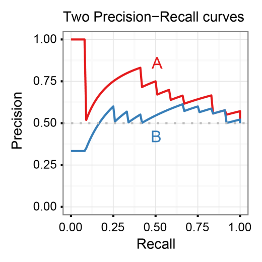
    If we plot the Recall on the x-axis, and the Precision on the y-axis while vary the threshold of the model, then we will have a Precision-Recall curve. It is a model-wide measure for evaluation binary classifiers. Of course, we want our model has high Recall and high Precision, that is, we want our model to move close to the right corner on the plot. It usually can also be used to compare different models, see the example here: 
    image
    Figure is from a nice blog post - Introduction to the Precision-Recall plot
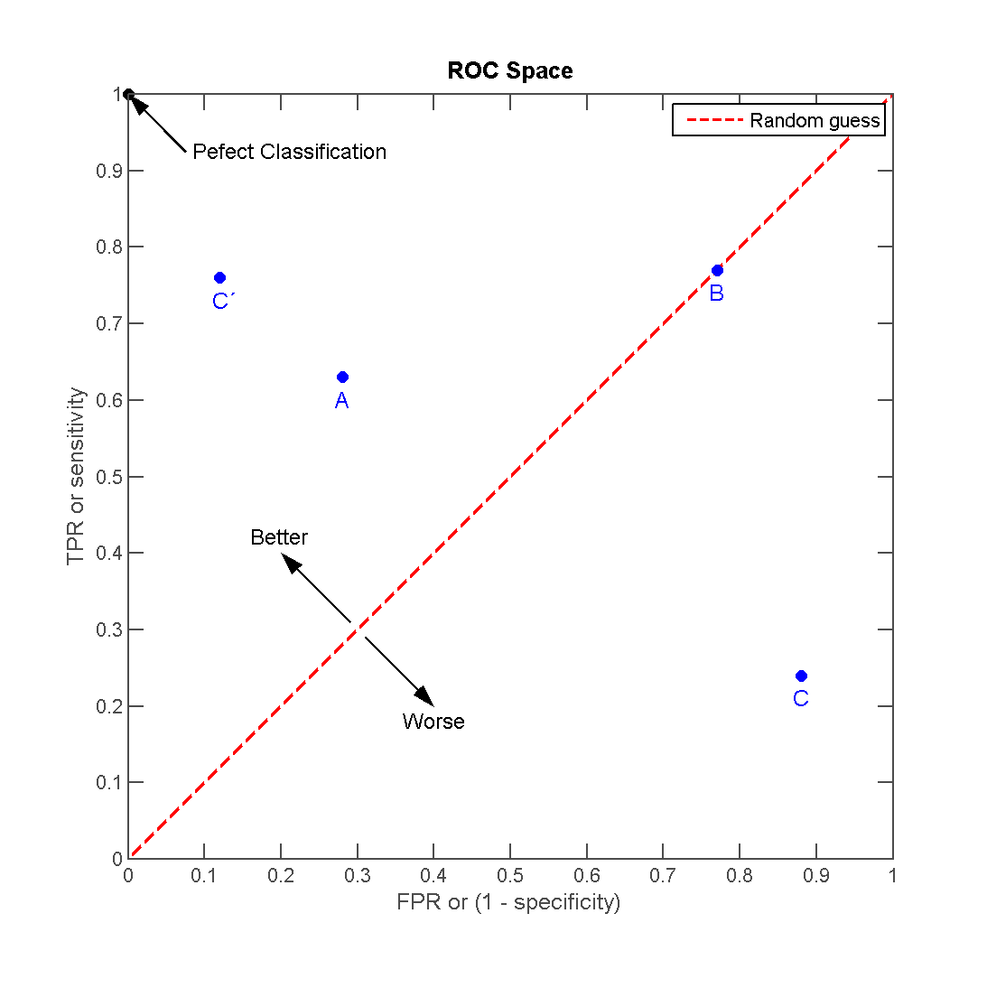
    The ROC curve (Receiver Operating Characteristic) is a plot that illustrates the performance of a binary classifier when the threshold of the classifier is varied. It plots the False Positive Rate (100 - Specificity) on the x-axis, and True Positive Rate (Recall/Sensitivity) on the y-axis. We know how to calculate Recall from above, but for the False Positive Rate, which tries to answer 'Within all the real spider mans, how many of the model estimated as iron man?', is calculated as: 
    False Positive Rate = FP / (FP + TN) = 60 / (60 + 40) = 0.6     
    Therefore, on the ROC curve, we want our model to have a small False Positive Rate, but a large True Positive Rate (Recall), that is, we want our model to move close to the left corner. See an example here from WiKi:
    image
    We can see the Precision-Recall curve and the ROC curve are closely related with each other, but the key differences between them are lie on what your problem need. If your problem have an inbalanced dataset, that is you have a few of positive samples but a lot of negative samples (100 iron man, and 100000 spider man), and you are more care of finding the iron man out, then you should use Precision-Recall curve. Otherwise, you can use ROC curve. See a nice discussion on Quora here
    For more details, there is a very nice paper The Relationship Between Precision-Recall and ROC Curves
  5. How can you prove that one improvement you've brought to an algorithm is really an improvement over not doing anything?
    My answer to this question is simply do a A/B testing. With the same settings (dataset, hardware environment etc.), we can run both the older version of the algorithm and the modified version, and then compare the results in terms of performance (accuracy, speed, usage of resources, etc.). 
  6. What is root cause analysis?
    I am not so familiar with this analysis. But it seems a technique to identify the underlying causes of why something occurred (usually bad accidents), so that the most effective solutions can be identified and implemented. It is a method of problem solving used for identifying the root causes, according to WiKi
  7. Are you familiar with pricing optimization, price elasticity, inventory management, competitive intelligence? Give examples.
    No. I am not familiar with this at all. But a quick check with WiKi seems give enough answer. 
    Pricing optimization: With the optimization in the term, I think we can guess most of it. This is usually used in industry to analyze the response of the customers to the change of the price of the product, and how the company set the price for a product to maximize the profit. 
    price elasticity: a measure used in economics to show the responsiveness, or elasticity, of the quantity demanded of a good or service to a change in its price. More precisely, it gives the percentage change in quantity demanded in response to a one percent change in price. 
    inventory management: How to efficiently manage the product in inventory so that the company can reduce the cost while still can provide the customers with timely product. Amazon is doing a really good job on this I am guessing. 
    competitive intelligence: means understanding and learning what's happening in the world outside your business so you can be as competitive as possible. It means learning as much as possible--as soon as possible--about your industry in general, your competitors, or even your county's particular zoning rules. In short, it empowers you to anticipate and face challenges head on. 
  8. What is statistical power?
    Statistical power is the likelihood that a study will detect an effect when there is an effect there to be detected referred from here. It depends mainly on the effect size, the sample size. Here is a very nice analogy to understand more of the statistical power. 
  9. Explain what resampling methods are and why they are useful. Also explain their limitations.
    Resampling methods differs from the classical parametric tests that compare observed statistics to theoretical sampling distributions, it is based on repeated sampling within the same sample to draw the inference. The resampling methods are simpler and more accurate, require fewer assumptions, and have greater generalizability. 
    Resampling can be used for different purposes, and the most common ones are: 
    • To validate models - methods like bootstrapcross-validation. For example, we usually can use 10-Fold cross-validation to validate our model on limited dataset, or to choose a desire parameters. 
    • Estimating the precision/uncertainty of sample statistics (medians, variance, etc), like jackknife, bootstrap. For example, in order to get a confidence interval of certain parameters we interested, we can use bootstrap to achieve that.
    • To test hypotheses of 'no effect', like Permutation test which exchanges labels on data points to test statistic under the null hypothesis in order to perform a statistical significance test.
    • To approximate the numerical results, like Monte Carlo, which rely on repeated random sampling from the known characteristics. Like in the MCMC used in Bayesian statistics, which we can get the posterior distribution by sampling that is impossible to get a analytics solution.
    Jake VanderPlas gave a nice talk on PyCon 2016, which briefly touched some parts of the resampling method, you can find the video of the talk here, and the slides here. For further readings:
    A gentle introduction to Resampling techniques.
    Resampling Statistics.
    Resampling methods: Concepts, Applications, and Justification
    For the limitations, 
    • Computationally heavy. It is only recent years with the advance of the computer power, the resampling method starts to get popular.
    • Variability due to finite replications. Also, for the validation can be highly variable.
  10. Is it better to have too many false positives, or too many false negatives? Explain.
    This depends on your need and the consequences of the decision. I will give two examples. 
    (1) If we are working in a top secret institution, we have an automatic door that check if the person wants to enter it is a stuff or stranger, and we want to stop the strangers for security reasons - we want to identify the strangers who are not working here. If a staff is stopped by the door, because the algorithm thinks he/she is a stranger, this is the case of false negatives. If the algorithm fails to detect a stranger and let him/her in, this is a false positives. In this example, we'd rather to have many false negatives, that is, stop the staff due to recognize him/her as a stranger. The consequence is just to re-check the staff by authorities. If we have too many false positives, we will have a lot of strangers enter into our institution and may have a big security problem! 
    (2) In a hospital, we want an algorithm to identify if the patient has malignant tumor for further treatment. The algorithm will classify the patient either as benign or malignant tumor. If a patient has benign tumor but classified as malignant, this is a false positives. A false negatives is when the patient has a malignant tumor but classified as benign. In this example, we prefer the algorithm to have more false positives. Since the consequence is for the patient to do more tests to confirm. But if we have a high false negatives, we will miss a lot of the patient who has the malignant tumor for the best treatment time.